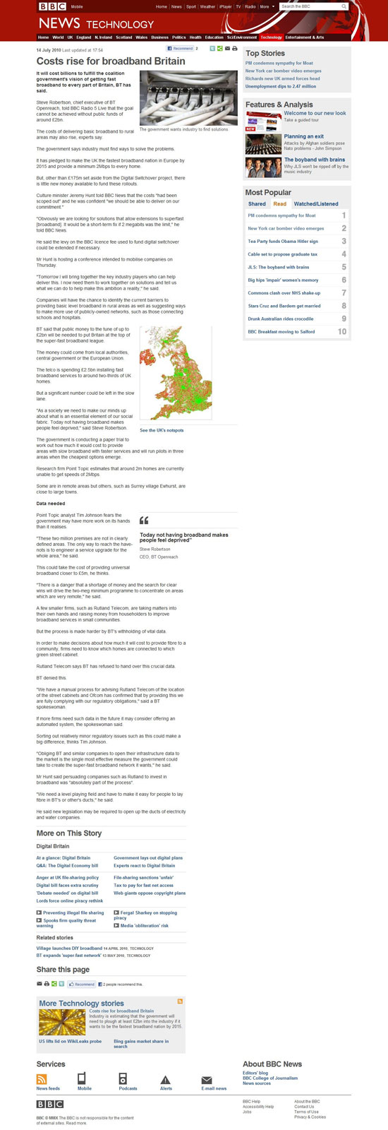
BBC News Website
What were the BBC thinking when they decided to redesign the News section of the website. There is so much whitespace it is ridiculous. Here's a screen shot so you can see what I mean.
Details:
Admin
14.07.2010 19:53:00
Tags:
bbc
website